Forex Charting Types Explained

Whether you trade Forex, stocks or commodities, you’ve likely encountered price charts. Charts are not necessary to place trades or even make a sound trading decision.
That said, the truth is that the majority of traders rely on charts to find new trade opportunities.
Given the importance of charts and their role in technical and other types of analysis, let’s dig deeper about Forex charts and charting types.
- Learn more, take our free course: Getting Started with Charts
What is a Forex Chart?
A Forex chart is used to get a graphical representation of a currency pair’s exchange rate moves.
It offers an easy way to analyse past price movements and the current price-action. it also forms the foundation of anticipating future movements using technical charts analysis. While Forex charts can come in a variety of forms, such as line charts, bar charts and candlestick charts, they all are representing exchange rate moves with only small differences.
The x-axis of a Forex chart is used to show the time, while the y-axis shows the exchange rate.
By applying technical tools such as trendlines, channels or Fibonacci levels, technical traders try to anticipate future price movements of a currency pair. Many traders also apply technical indicators either on the price-chart itself or in a separate indicator window, which is usually placed just below market charts.
- Learn more, take our premium course: Trading for Beginners
Must Read: 19-Step Guide to Trading Forex for Beginners
How to Read a Forex Chart?
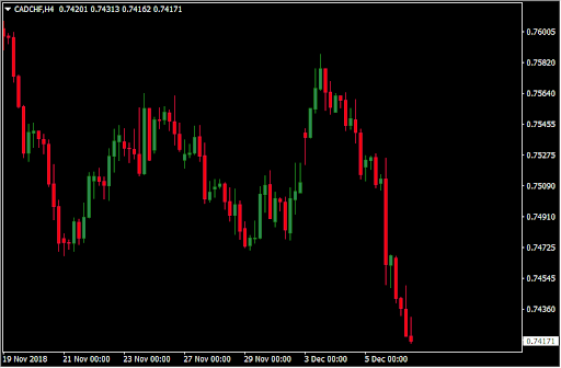
Reading a Forex chart is quite simple. The vertical axis shows the exchange rate of a currency pair, and the horizontal axis the date and time. The following image shows a typical candlestick (OHLC) Forex chart.
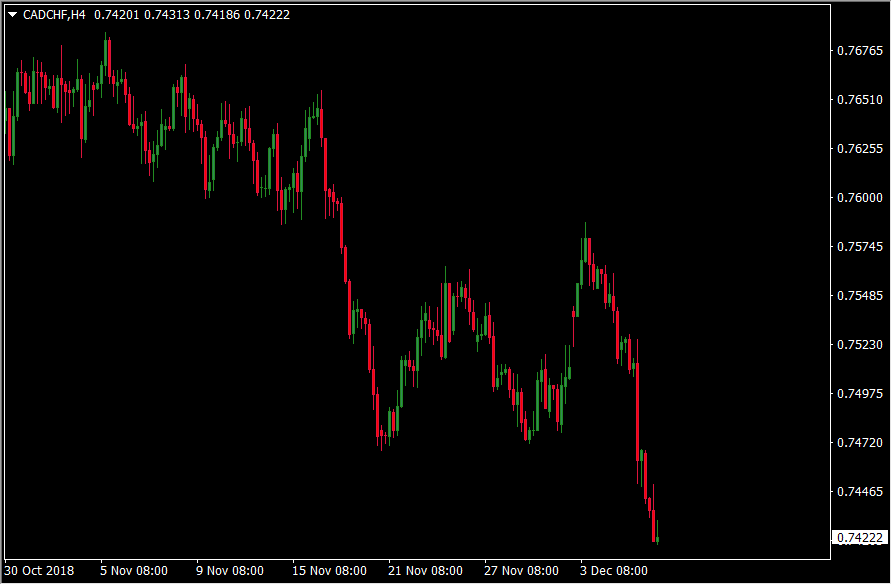
This chart shows the movement of the CAD/CHF pair on the 4-hour chart. Candlestick charts are also known as OHLC charts, as they show the open, high, low and close prices for each trading session. We’ll cover the most important types of Forex charts in the next section.
Read:
- Crypto vs. Forex Trading: Battle of the Up n’ Comers
- Why Forex is or Isn’t for You
- How do you Become a Professional Trader?
Types of Forex Charts
While there are many types of Forex charts, they all serve the same purpose – representing the price-moves through time. These are the most important types of Forex charts:
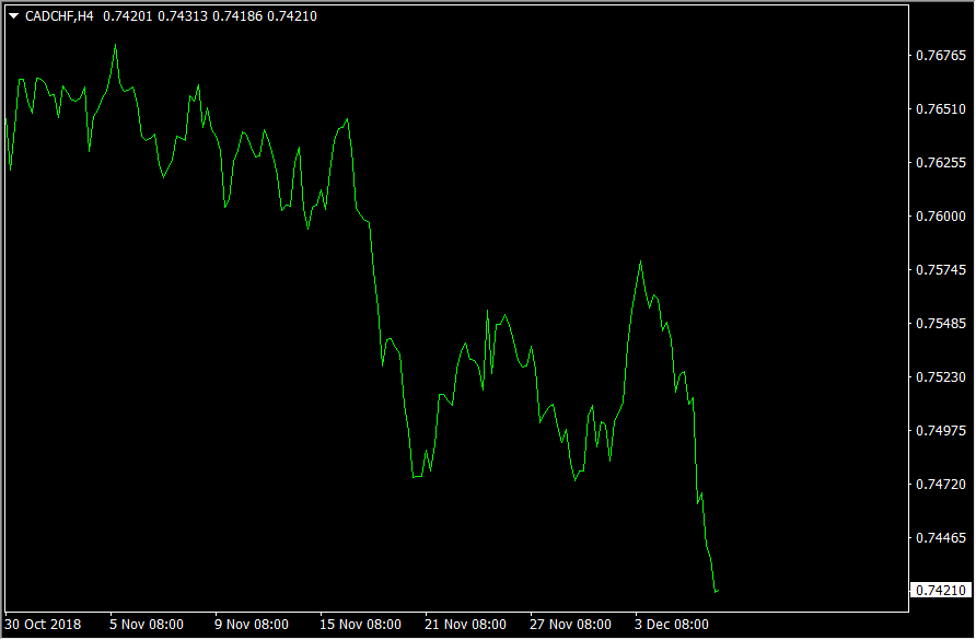
- Line Chart – A line chart is the most basic type of Forex chart. It shows a simple line which connects the closing prices for each trading session. While line charts can be useful to quickly identify the trend of a currency pair, they’re not actively used by Forex traders. The following chart is a line chart.
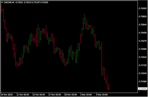
- Bar Chart – Unlike line charts, bar charts include a range of useful information. They are OHLC charts, which means that the show the open, high, low and close prices for every single trading session. Forex traders use this information to draw trendlines and support and resistance levels and to get a feeling of how buyers and sellers are moving the price during a trading session. The following chart is a bar chart. The left and right dashes represent the open and close prices, while the upper and lower lines represent the high and low price for the respective trading session.
- Candlestick Chart – Candlestick charts resemble bar charts to a large degree, with the only difference that candlestick charts connect the opening and closing prices and fill the open-close range with colour. Candlestick charts have first been used by Japanese rice traders before Steve Nison introduced this chart type to the Western trading world. Since then, candlestick charts are the most popular type of charts for Forex traders.
The main advantage of candlestick charts over bar charts is that they offer an easier way to spot the open and close prices of a trading session. Forex traders also use candlestick charts to trade with candlestick patterns, which are used to confirm a trade setup.
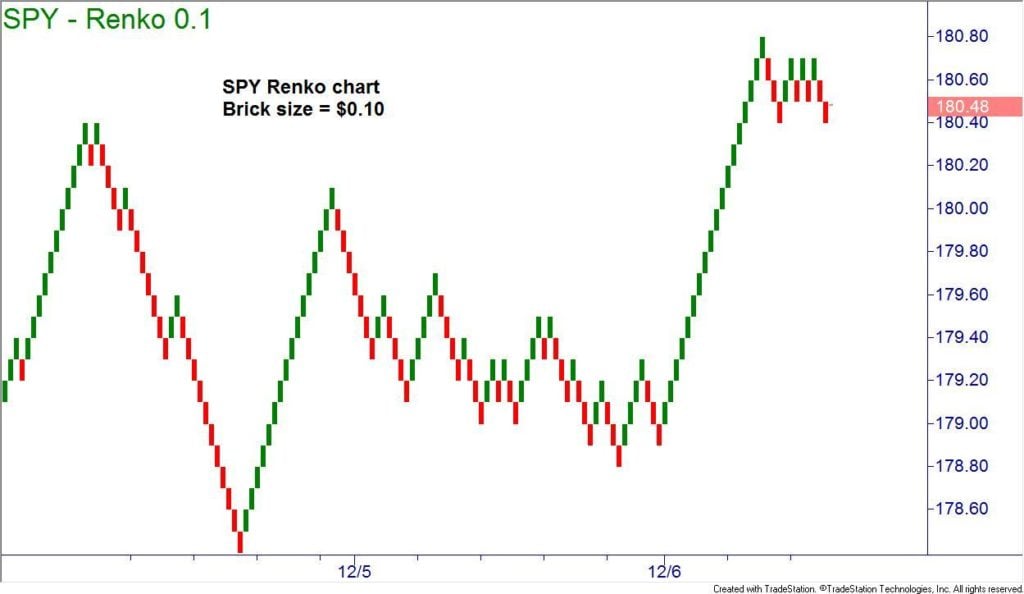
- Renko Chart – Unlike the other chart types explained above, Renko charts are used to represent only the price movement. Each brick in a Renko chart represents a pre-determined amount of price volatility. Renko charts, shown in the following image, are not actively used in Forex trading.
How to Range Trade in Forex Using a Price Chart
Forex charts are an essential building block of many trading strategies, especially those strategies which are based on technical entry and exit points. This means that Forex charts can be used to trade all market environments, including ranging markets.
To trade a ranging market in Forex with a price-chart, you need first to identify a ranging market by drawing horizontal support and resistance lines on previous swing lows and highs. If the price-action doesn’t show new peaks and troughs, the currency pair is likely ranging.
Alternatively, you can use the Average Directional Movement Index (ADX) to analyse a Forex chart and measure the strength of the current trend. If the indicator shows a value of below 25, the market is likely ranging.
The following chart shows a ranging market in EUR/JPY.
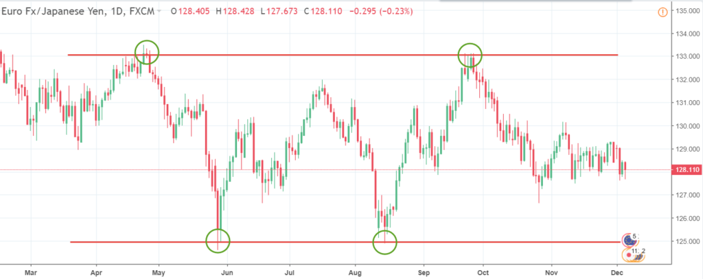
Once a ranging market is identified with an upper horizontal resistance line and a lower horizontal support line, a trader could enter with a long position when the price reaches the lower support, and with a short position when the price reaches the upper resistance.
Stop-loss orders would be placed just above the upper resistance line in case of a short position, and just below the lower support line in case of a long position.
Be Prepared: Forex Risk Management Strategies That Will Save You Money
Popular Forex Chart Patterns
Forex charts offer a valuable insight into the past performance of a currency pair. While analysing this past performance, traders and analysts have found that certain price patterns tend to form over and over again, providing the power to anticipate future price moves.
These price patterns are simply called chart patterns and often all timeframes. These include short-term ones such as the 30-minutes and 1-hour TF, to longer-term ones such as the daily and weekly. Here is a short overview of the most popular chart patterns.
- Head and Shoulders
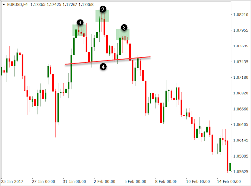
The head and shoulders pattern is arguably one of the most recognisable patterns in Forex. It resembles a head with two shoulders and signals a potential trend reversal. The line that connects the lows of the shoulders is called the neckline.
Once the neckline breaks, a trader could enter in the direction of the breakout with a profit target equal to the height of the pattern from the neckline to the head. The following chart shows a typical head and shoulders pattern (1-left shoulder, 2-head, 3-right shoulder, 4-neckline.) If a head and shoulder pattern forms during a downtrend, it’s called an inverse head and shoulders pattern.
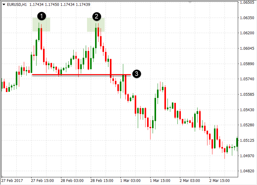
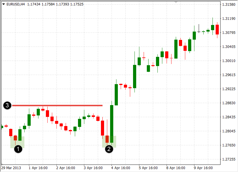
- Double Top/Bottom
A double top/bottom pattern is also a reversal pattern that often forms at the top of uptrends (double tops) and the bottom of downtrends (double bottoms). As its name suggests, a double top pattern forms when the price tries to break above a price-level for two times, but fails at around the same price.
Similarly, double bottoms form when the price tries to break below a price-level for two times but fails to do so.
The following charts show a double top/bottom pattern. A neckline is drawn at the low between the two tops, or at the high between the two bottoms, the break of which confirms the pattern.
Double top (1-first top, 2-second top, 3-neckline):
Double bottom (1- first bottom, 2-second bottom, 3-neckline):
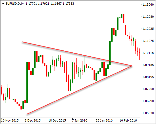
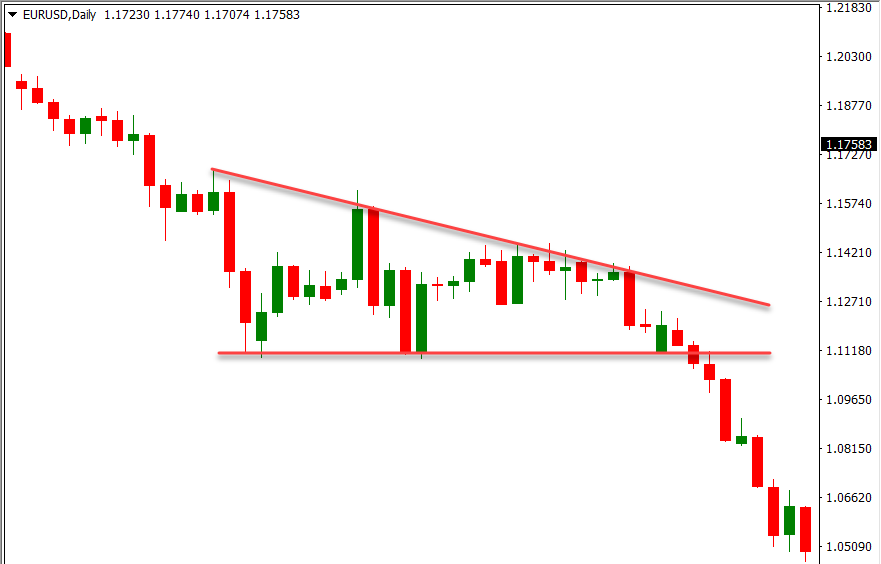
- Triangle Pattern
Triangle patterns are another popular Forex chart pattern which signals the possibility of a continuation of the underlying trend. They look like a triangle, as the price-volatility is gradually vanishing before a breakout occurs. That’s why triangle patterns are signal a consolidation of market participants after a strong up-move or down-move.
There are three main types of triangle patterns:
- Symmetrical triangles
- Ascending triangles
- Descending triangles
All three types are shown in the following charts. Once a triangle pattern breaks, a trader would enter in the direction of the breakout and target a price equal to the height of the pattern projected from the breakout point. Wedge patterns are quite similar to triangles, only that in wedges both lines are sloping either upwards or downwards.
- Learn more, take our free course: Continuation Price Patterns
1) Symmetrical triangles
2) Ascending triangles
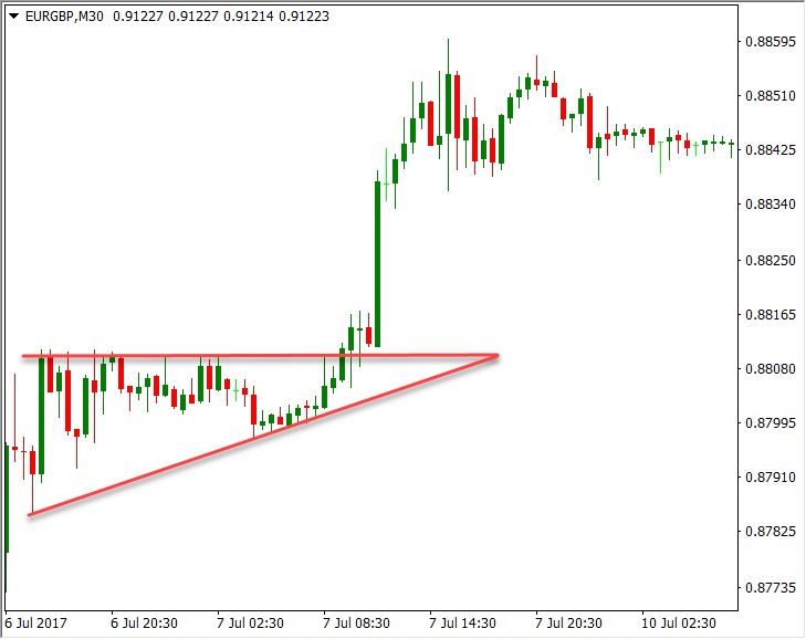
3) Descending triangles
Check out these awesome Forex examples. They run through scenarios you may encounter.
Forex Charts FAQ:
- How to Read the Candlestick Chart in Forex Trading
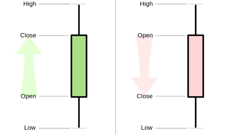
Candlestick charts are Open-High-Low-Close charts which are extremely popular in Forex trading. A candlestick chart consists of candlesticks, which are formed by a solid body and upper and lower wicks.
The body of a candlestick represents the open and close prices, while upper and lower wicks show the highest and lowest prices reached during the trading session.
The formation of a single candlestick is shown in the next image.
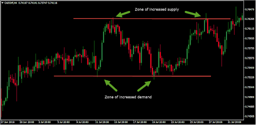
2. How to Find Supply and Demand On a Price Chart for Forex
Supply and demand are the elemental forces that drive the price of a financial instrument up or down. Forex charts can be used to identify zones of supply and demand by marking important support and resistance zones and measuring the momentum of candlesticks when those zones are reached.
3. What Does a Candle Wick on a Forex Chart Mean?
Candle wicks represent the highest and lowest prices reached during a trading session.
Forex traders can get a lot of valuable information from analysing candle wicks, as a long upper candle signals that buyers pushed the price higher but sellers jumped into the market and pressured the closing price down, signalling that sellers still have the upper hand.
The same applies for long lower wicks. Wicks play an important role in candlestick patterns.
4. How Reliable is the Forex Hourly Chart?
Short-term and intraday timeframes, such as the hourly, tend to incorporate a lot of market noise caused by over-reaction to news, bandwagon effects or speculation.
That’s why many technical tools, such as chart patterns, return better results when applied to longer-term timeframes such as the 4-hour or daily ones. While you still may be able to trade from the hourly chart, bear in mind that the intraday charts tend to produce more false signals and losing trades.
5. What Currency is Looked at in a Forex Chart?
Each Forex chart shows the price of the base currency (first currency) relative to the counter currency (second currency). If a Forex chart shows an uptrend, this means that the base currency is appreciating against the counter currency. Similarly, if the chart shows a downtrend, this means that the base currency is depreciating against the counter currency.
For example, the EUR/USD chart shows the price of euros in US dollar terms.
6. Why Trade the 4-Hour Forex Chart?
For many traders, the 4-hour Forex chart is the sweet spot between shorter-term unreliable timeframes and longer-term timeframes which can take days to reveal a trade setup. Six 4-hour candles form a trading day, and a typical laptop screen can show months of trading data on a 4-hour timeframe.
7. What Makes a Candle Green in a Forex Chart?
The body of a candlestick represents the span between the opening and closing prices. If the closing price is below the opening price, the candle’s body will be red, and if the closing price is above the opening price, the candle’s body will be green. Many modern trading platforms allow you to fully customise the presentation of Forex charts and single candlesticks, including their colours.
8. What are the Most Accurate EMAs for the Daily Forex Price Chart?
Exponential moving averages (EMAs) are often used on the daily Forex chart to identify trade setups based on the MA-crossover strategy and to find dynamic support and resistance levels. The most accurate EMA on the daily chart is the 200-day EMA, followed by the 100-day EMA and the 50-day EMA.
- Learn more, take our premium course: Trading for Beginners
When all is said and done, charting types are important
Forex charts are used by the overwhelming majority of traders to scan the market for tradeable setups. They form the basis of technical analysis, which uses past price-action to anticipate future price movements. In most chart types, the horizontal axis represents the time and the vertical axis represents the exchange rate of a currency pair.
There are many types of trading charts, including line charts, bar charts, candlestick charts and Renko charts.
Out of them, candlestick charts are the most popular type of charts among retail Forex traders, as they provide a graphically appealing way to represent the open, high, low and close prices of a trading session. In addition, many traders use candlestick charts to find candlestick patterns which are used to confirm a trade setup.